
Size does matter: Area Cartograms in Cadenza
Traditional visualizations
To not bore you with history lessons, theoretical explanations, and reasonings before you even get to see anything, here we go: Each federal state in Germany shown as a choropleth map where each state is colored to show the amount of crimes reported in 2018.
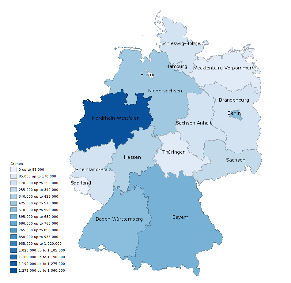
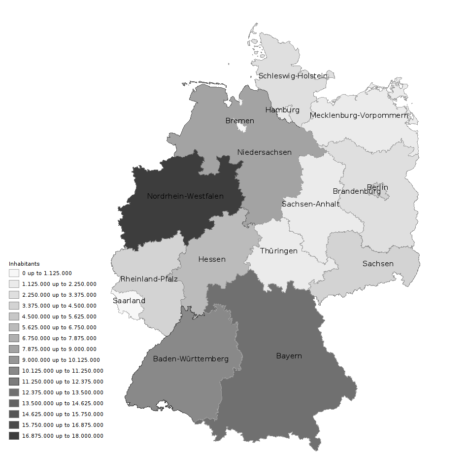
The data is based on statistics published by the German Federal Criminal Police Office (BKA) for the year 2018. First thing that catches the eye is North Rhine-Westphalia and the southern part appearing to be criminal hotspots. Looking at this map you would think twice before going to carneval or the Oktoberfest next year. But the colors and shapes try to mislead you here since they basically only manage to visualize the population density.
So the next step is to instead use a choropleth map visualizing crimes per capita.
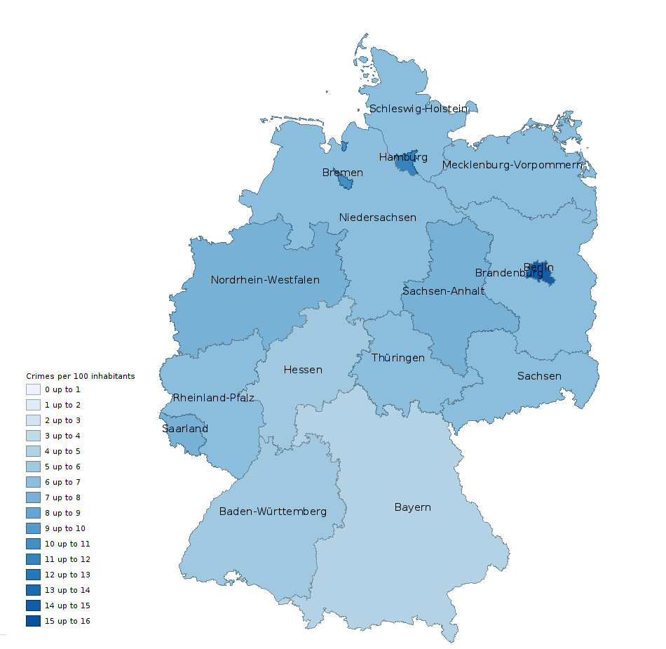
Now it looks more evenly spread as one would expect. Some small darker regions exist but at least Bavaria, Baden-Württemberg, and Hesse are now safe havens.
This kind of visualizations is very common and usually get’s the job done. But since humans are imperfect machines we are easily fooled in our limited perception. In this case what happens is that the visualization of each federal state emits or reflects a certain amount of light in a certain wavelength and amplitude, the light then gets caught by our eyes and processed in our brain. And we overlook the huge impact the tiny states Berlin, Hamburg and Bremen have on the color scale.
Cartogram visualizations
What are alternatives that don’t fool us by predominantly showing big regions with little impact? Looks like we have to bend space! We can find a solution in using cartograms.
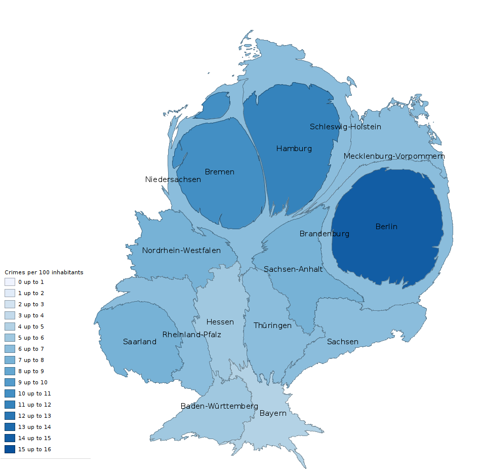
Cartograms take up a niche somewhere between charts and maps and there exist quite a few variants. Reading a small history of cartograms one finds applications in visualizing population, industrial productivity, or voting results. All cartograms work by modifying the original input region or line in order to better visualize a certain property. From here on out, I’ll only be talking about area cartograms, but be reminded that linear cartograms exists as well and might be used to visualize distances - like in a schematic subway map. The methods of generating cartograms all need to take a compromise between
- showing the correct target area,
- retaining the topology so that neighbors stay neighbors,
- retaining the shape and position so that regions can be easily recognized
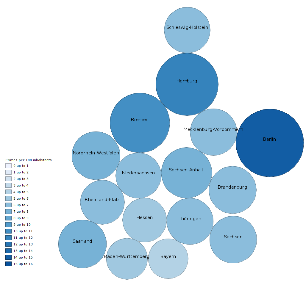
Let me show you another example. One of the earlier known variants is named after Dorling. It focuses on showing the correct area but completely ignores the original shape by drawing circles instead of the original geometry. If you’ve ever tried to put glasses tightly next to each other into a cupboard, you’ll know that it is impossible to avoid gaps. Depending on the size of the glasses it is also never possible to arrange them in such a way that they touch a given subset of the other glasses. Hence, the topology will most likely be lost. But maybe this visualization is still more useful than just stacking bar charts next to each other because in such a chart you lose any intuition on recognizing spatially correlated data.
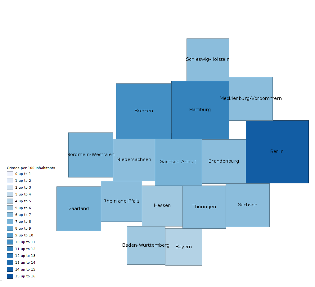
Another cartogram visualization is named after Demer and uses rectangles (or here, squares) instead of circles. The tradeoffs are similar to Dorling, but most people find it even easier to estimate sizes of squares than sizes of circles. It also allows us to create a base square unit that can be used to rasterize each square to allow comparison-by-counting and would allow for a simple explanation in the map’s legend. One could further fine tune the layouting algorithm to avoid some gaps, but as for Dorling it is impossible to avoid them all.
Cartogram visualizations are not too well known, you rarely find any tool that allows a dynamic cartogram based visualization and the main reason is simply that it used to be quite expensive and tricky to generate such a visualization. The variants with simple circle, rectangle, or hexagonal shapes are easier to calculate, often implemented using some rubberband-like algorithm that pulls certain important coordinates of neighbored regions together to reach an equilibrium.
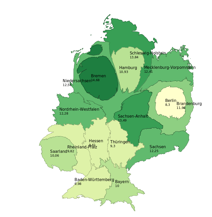
The calculation of area continuous cartograms that tries to retain the original shape and topology needs more sophisticated algorithms. It used to take up to minutes even on good hardware and was just not usable in a dynamic map. In their most recent publication on cartogram creation, Gastner, Seguy & More published 1 a fast flow based algorithm under the project go-cart, which is greatly parallelizable. It is based on calculating a two dimensional transformation of a grid and, unlike many existing methods, depends neither on identifying important points on the boundary of polygons nor on polygon simplification. The advantage over pure boundary-only methods is that it is easier to retain validity of polygons and also transform holes or other geometries within a polygon like rivers, label-points, or landmarks.
Based on this amazing project I spent some free time to make this algorithm and method freely available to the JVM: jacart, published on Maven central.
Summary
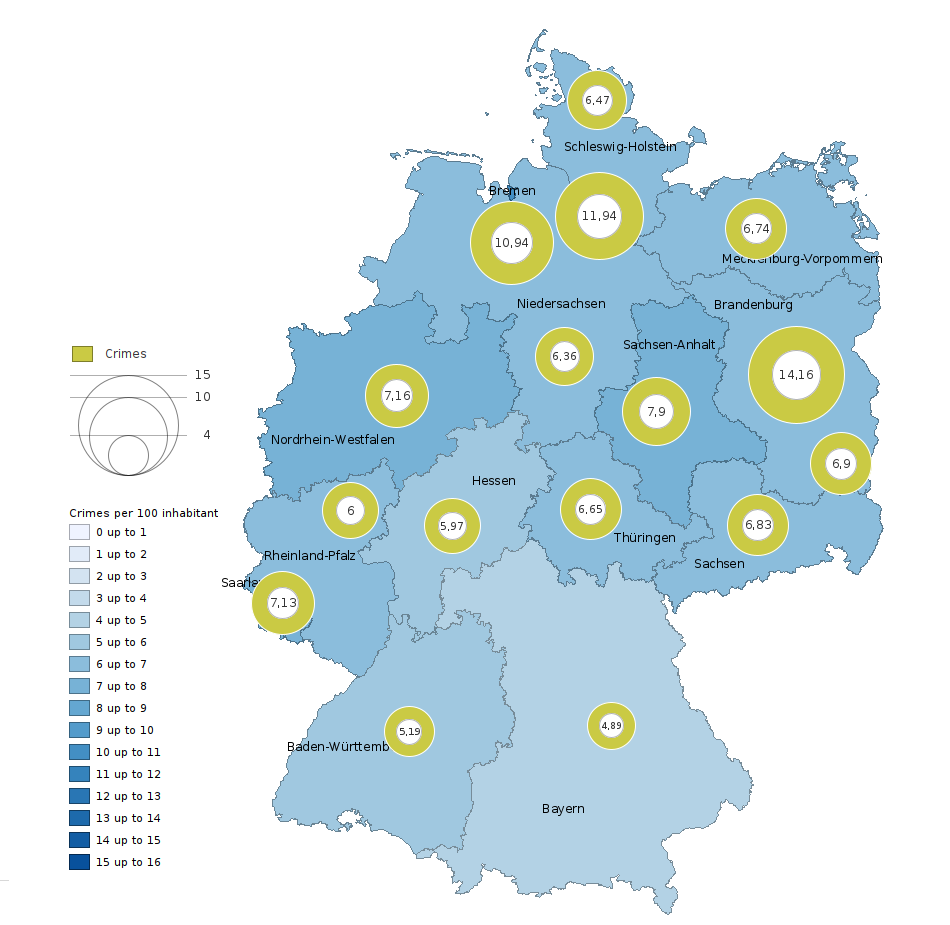
Yet another visualization tries to bridge the gap between maps and charts by simply merging both into one. Using an area proportional point within a region one can represent a value without losing much of the control over the visual impact on the reader.
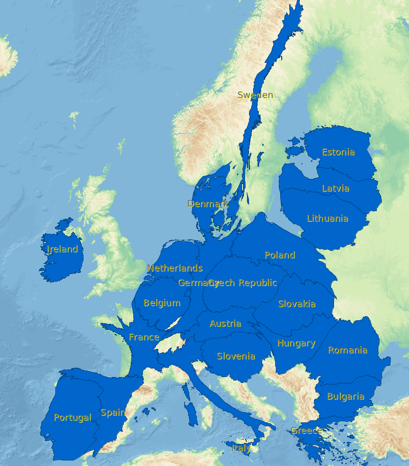
To end with something nice and to not stir up fears like other recent postings on the internet, here are maps of dogs. Shown are the amount of dogs per capita in Germany and in Europe.
Note: All crime data based maps of Germany use an equal area projection (EPSG:23035).
-
Gastner MT, Seguy V, More P. Fast flow-based algorithm for creating density-equalizing map projections. Proc Natl Acad Sci USA 115(10):E2156–E2164 (2018) ↩
Share via


